Overview
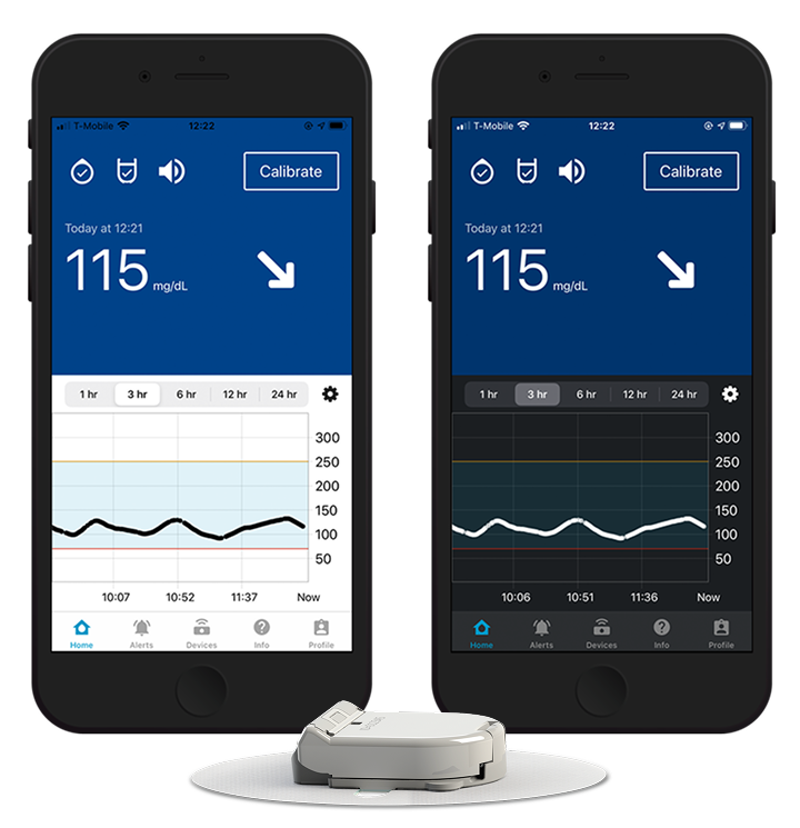
The GlucoMen Day Continuous Glucose Monitor provides a glucose reading every minute by measuring the amount of glucose in interstitial fluid. The system consist of a sensor that’s inserted in the skin, a transmitter that sends glucose readings from the sensor to the receiver, and a mobile app (iOS and Android) that serves as the receiver and displays the glucose reading and trend.
My role
I worked on this project from initial kickoff to commercial release, collaborating with a team of software developers, firmware engineers, researchers, and clinical team members, among others.
Primary tasks
Secondary tasks
Assisted with clinical study in Europe
Wrote the owner’s guide
Implemented dark mode for iOS
Wrote the JavaScript for generating a summary report in the app
Research
There were four main sources of initial research for this project.

Interviews
Learn what users like and dislike about their current CGM system
App reviews
Identify themes in app reviews for competitor products

Diabetes forums
Learn what questions people often have about CGMs

YouTube videos
Watch people unbox their CGM and change their sensor
Key insights
Initial designs
With the key insights in mind, I started with some rough designs to figure out the overall navigation scheme and information architecture. The organization was based on the tasks users would do most frequently.
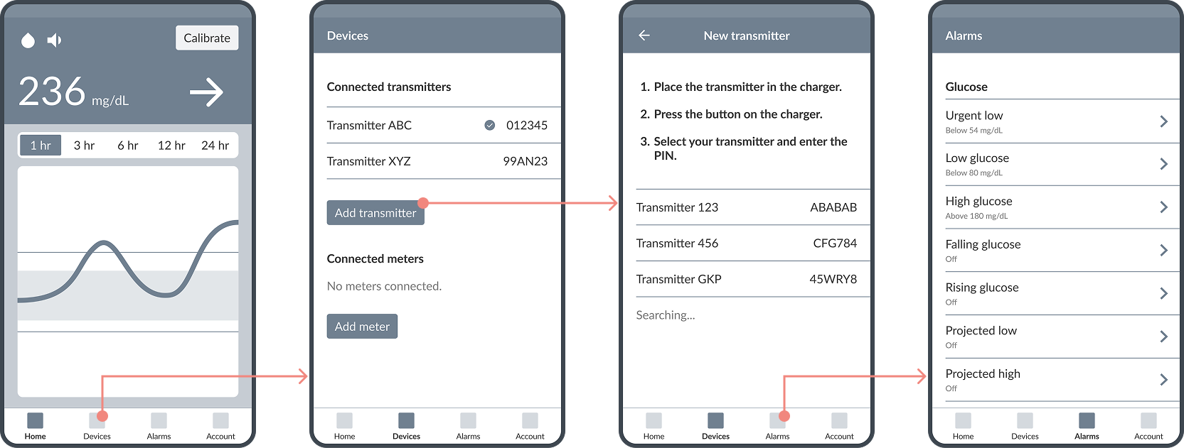
With a relatively small software team, I needed to be strategic about where to use custom components versus where to stick with standard components. I focused on the Home screen for customizations because that’s where users would spend most of their time.
Formative studies
Once I was happy with the initial designs, I worked with the clinical team to recruit participants for a formative study. I created an interactive prototype using screenshots that could be used on a mobile device. The study focused on four main areas:
1. Setting up the transmitters
Can users successfully pair two transmitters and select one to use?
2. Calibration
Can users successfully enter a blood glucose reading to calibrate the system?
3. Current glucose readings
Do users understand the current glucose reading and the trend arrow?
4. Glucose trend chart
Can users correctly interpret the glucose trend chart?
Key findings
The final design
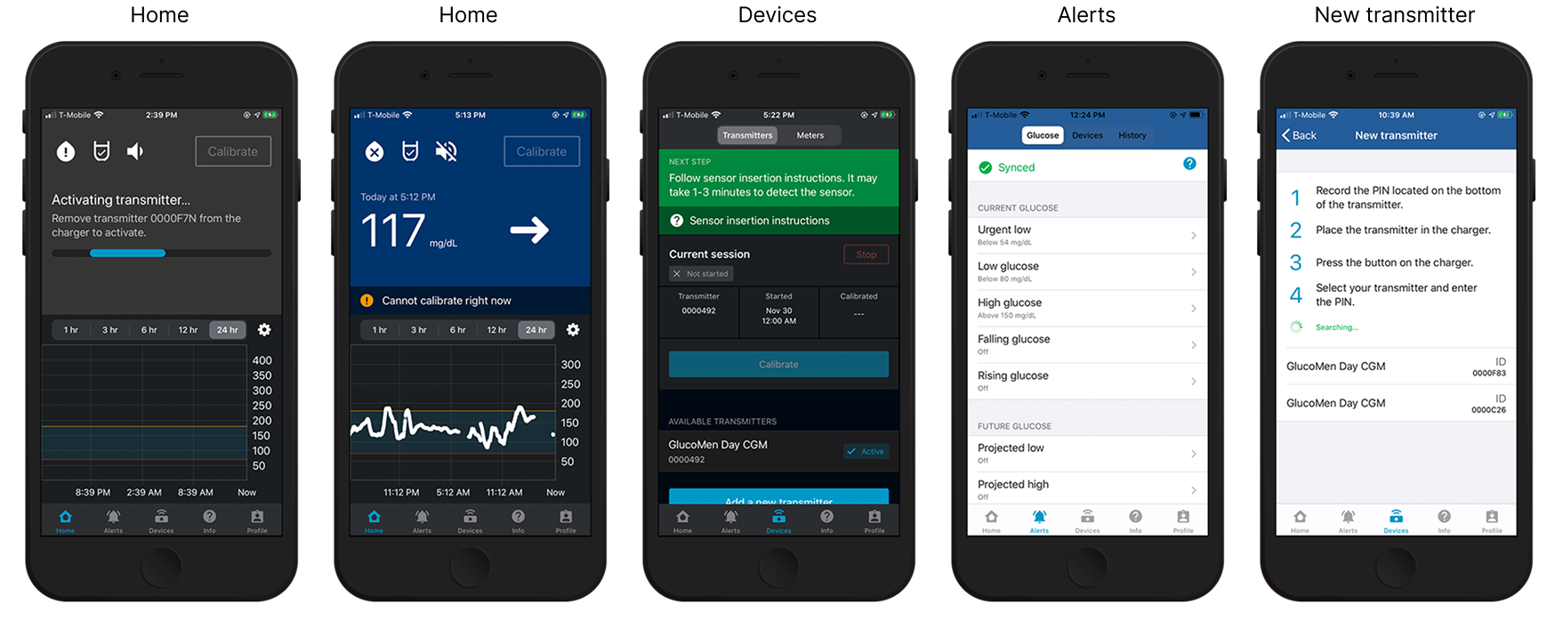
After incorporating feedback from the formative designs, including additional rounds of user testing, we landed on the final design. The Home screen serves as the main hub for the user, with other screens providing additional functionality as needed.
Home screen
One of the overarching improvements that I wanted to make based on the results of the formative usability studies was to ensure that the status of the system is very clear, especially if the system is waiting for the user to do something.
The approach I took was that anytime the user looks at the home screen, they should either see their current glucose reading OR clear instructions for what they need to do. This might include needing to connect a transmitter, activate a transmitter, insert a sensor, turn on Bluetooth, etc. I also added an icon indicating the transmitter status (mimicking the shape of the actual transmitter) so users can clearly see if the transmitter is connected.


To show additional contextual information, I introduced the concept of a banner that provides details about the current state. If users wants more information, they can tap on the banner. For example, if the banner indicates that you cannot calibrate right now (see below), tapping on it will display an explanation about why calibration is not currently allowed.

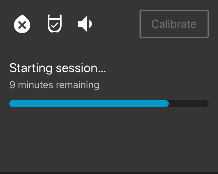

The bottom section of the Home screen displays a chart of recent CGM values, with the option to view exact values by dragging a finger on the chart. This is useful for understanding how glucose is trending to make any corrections needed to avoid going too high or too low.

Other considerations
Localization: The app was intended for a global audience and would be translated into multiple languages. That meant that elements had to be designed to expand whenever possible.
Glucose units: Depending on the country, glucose is either measured in mg/dL or mmol/L. To complicate things further, both units are used in Germany. The app needed to support both units and clearly indicate which unit of measure is being used because there is overlap in the ranges. For example, 33.3 mmol/L is very high, but 33.3 mg/dL is very low, so the units must always be displayed with the number to ensure the proper response.
Decimal format: The app needed to support displaying decimals with either a period or a comma, depending on the market. Both iOS and Android have built-in support for this behavior, but it needed to be planned for in advance.
Common documents: There were a number of areas where we wanted the iOS and Android apps to use the same code if possible. For example, documents such as the privacy policy and frequently asked questions consist of text and images and need to be displayed in the language of the phone, but don’t require any native functionality. We decided to use HTML/CSS/JS and URL parameters (to pass in the language) to separate the content from the app and make the documents easier to review and update.
Review and testing
As designs were implemented, I worked with developers to address any deviations from the design. We were also sending content out for translation, so part of my review was checking translations to make sure they were displayed as expected.

Outcome
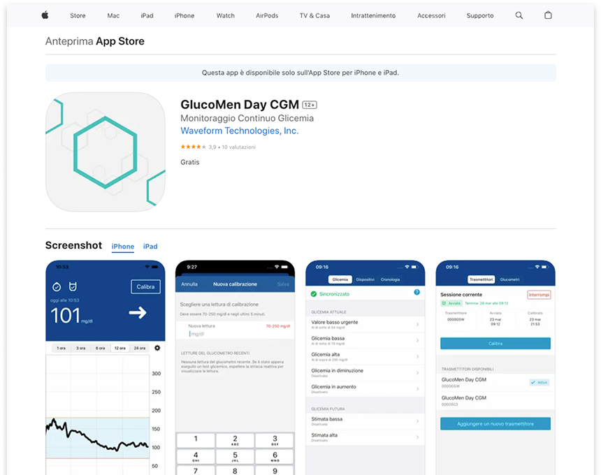
The GlucoMen Day CGM app was successfully released in Europe as part of the GlucoMen Day CGM system.
Challenges and lessons learned
Sometimes the best option isn’t an option
The most user-friendly option isn’t always feasible due to technical or safety reasons, so the challenge is to make the task the best it can be given the limitations.
Inter-departmental communication is key
This project was often a bit of a moving target, with multiple departments working on components that inevitably affected other components. For example, a simple algorithm change on the transmitter could impact the firmware implementation, which could then impact the information the app needed to communicate to the user.
Easy on one platform does not mean easy on another platform
This is not a new concept, but it was amplified because this was an extended project where both Android and iOS were often working on the same features. Something that was easy on one platform was, at times, complicated or even impossible on the other platform.
Alarms are difficult
Anyone who works on medical devices and applications will understand this sentiment. It’s amazing how may things have to be considered when it comes to alarms, such as regulations that require certain alarms, how different phones work with notifications, what settings you can make available, etc. There is also the delicate balance of providing enough alarms without annoying the user.