Overview
In this project, we set out to design a device that combines blood glucose measurements and basal insulin dose recommendations as part of a partnership between AgaMatrix and Sanofi.
The meter asks a series of simple questions and provides a suggestion for the next dose with the reasoning behind the suggestion. The user can either accept the suggestion or manually enter a different dose.
The problem
For patients taking long-acting (basal) insulin, the process of finding the correct dose is slow and often not linear. They need to slowly and methodically increase their dose until they reach a level of stability. They need to consider factors such as their fasting blood glucose, incidents of low blood glucose, and when they last increased their dose. In some cases, they may need to maintain their current dose or temporarily decrease their dose. This process can be overwhelming and 70% of individuals fail to reach their recommended target glucose1.
Another issue is that the guidance for titrating long-acting insulin is often country-specific, so an algorithm used in Canada may be different from what is done in Germany. There is no gold-standard.
My role
As the UX designer for this project, I was responsible for the user experience and interface design for the meter, from initial sketches to final assets. I also worked closely with the project team to refine the dose recommendation algorithm and translate it into a user-friendly set of questions.
Primary
Secondary
Helped refine the dose suggestion algorithm
Created promotional video presentations for the project
Drafted copy for the owner’s guide
Exploration
Is it a meter or an app?
One fundamental decision that needed to be made was whether we were designing a standalone blood glucose meter or designing an app that works with the wireless blood glucose meter we had previously developed.
Meter
App
The project team decided to move forward with a blood glucose meter because there were less unknowns in the process, understanding that an app could be introduced in the future as a replacement or an alternative.
Algorithm simplification
Dose recommendations in the meter are driven by an algorithm that takes information from the user, plugs it into the series of rules selected by the physician, and provides a suggestion for the next dose. The more information the algorithm has, the better the suggestion.
Example of a dose suggestion algorithm
One of the biggest challenges was determining which questions the user absolutely needed to answer, which questions would be nice to have but not required, and which questions could be eliminated altogether. We also worked to refine the wording to make the questions short and unambiguous.
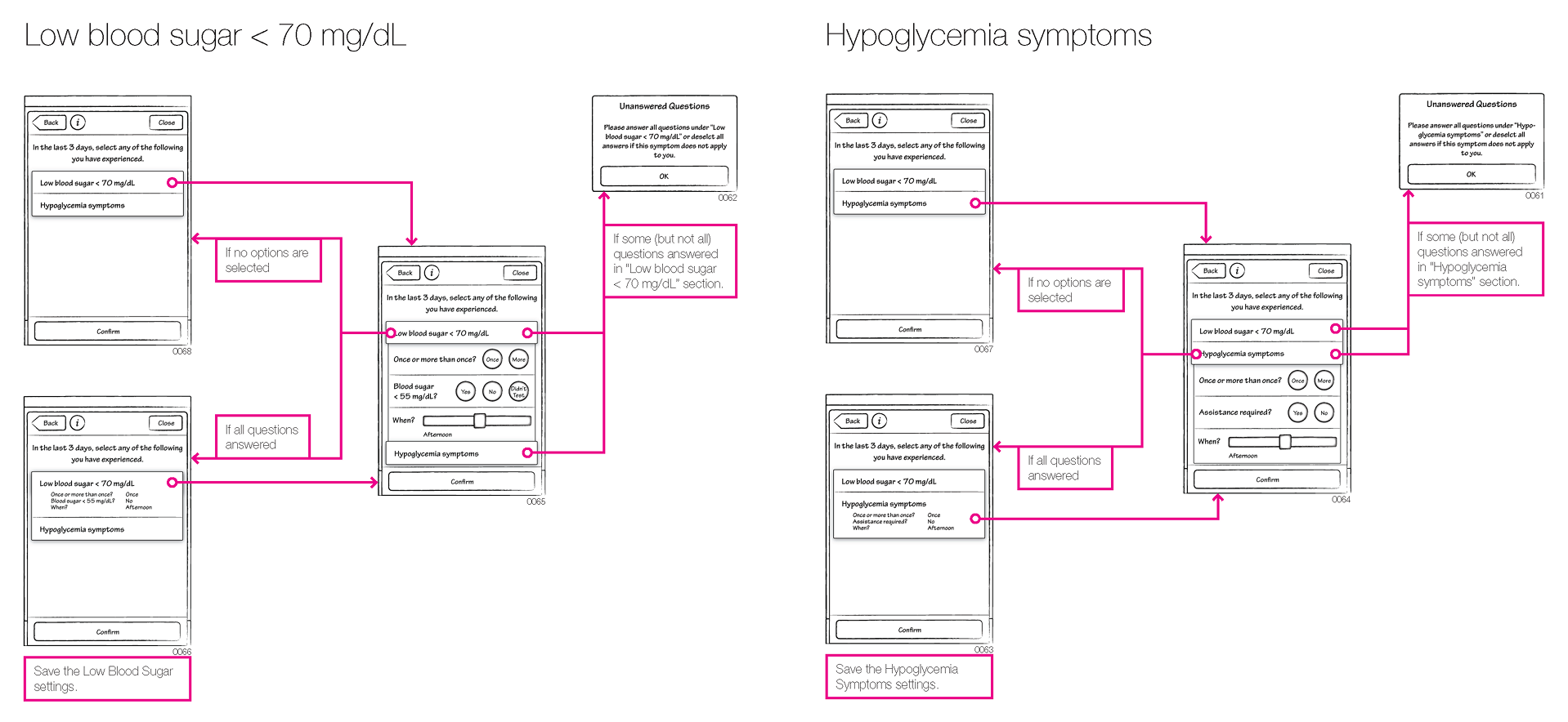
Through many iterations, we determined the minimum information the meter needed to know to provide a dose suggestion:
1. What was the user’s fasting blood glucose reading for today?
The meter should already know this because it automatically tags fasting readings based on the time of day (as set up by the user).
2. Did the user measure a low glucose reading with a different meter?
If a low glucose reading was already measured on this meter, we could skip this question.
3. Did the user experience symptoms of hypoglycemia (whether the blood glucose reading was low or not)?
If a low glucose reading was already measured on this meter, we could skip this question.
4. Did the user take any insulin doses other than the ones recorded in the meter?
This question always needs to be asked to avoid stacking insulin doses.
Color
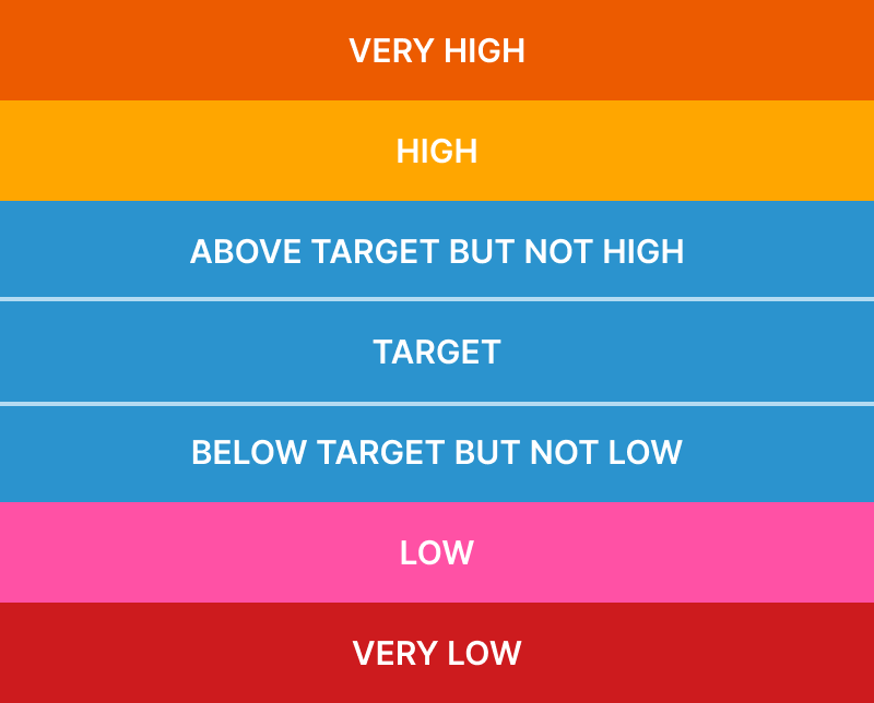
The use of color to represent glucose readings on the meter was another area of focus. We wanted to take advantage of the full-color LCD screen, but needed to be careful not to assign judgement (e.g., good or bad) to glucose values. A value that might be high for one person could be in target for someone else.
Evaluating colors
Another consideration was how many colors the user can reasonably distinguish. For example, we considered using three shades of blue to represent the three ranges that are not high or low, but some quick testing revealed that we were getting too granular. Users either didn’t notice the difference or they noticed the difference but didn’t assign any meaning to to it.
Personalization
With the prevalence of Type 2 diabetes, it is possible that two people in the same household could both have a meter, so we needed a way for users to identify their meter. As a team, we discussed a number of options and chose one that balanced the user’s need and development time:
Option 1: Allow users to type their name or initials and display them on the screen. This was eliminated because we didn’t want to burden the user with having to type on the device (no keyboard).
Option 2: Allow users to add their own avatar. This was eliminated because the meter had no easy way to upload an image (no internet connection, no camera).
Option 3: Provide removable covers in different colors so that users in the same household can choose different colored covers. This was viewed as a good option, but outside the scope of the project. Providing detachable covers could be considered for future releases.
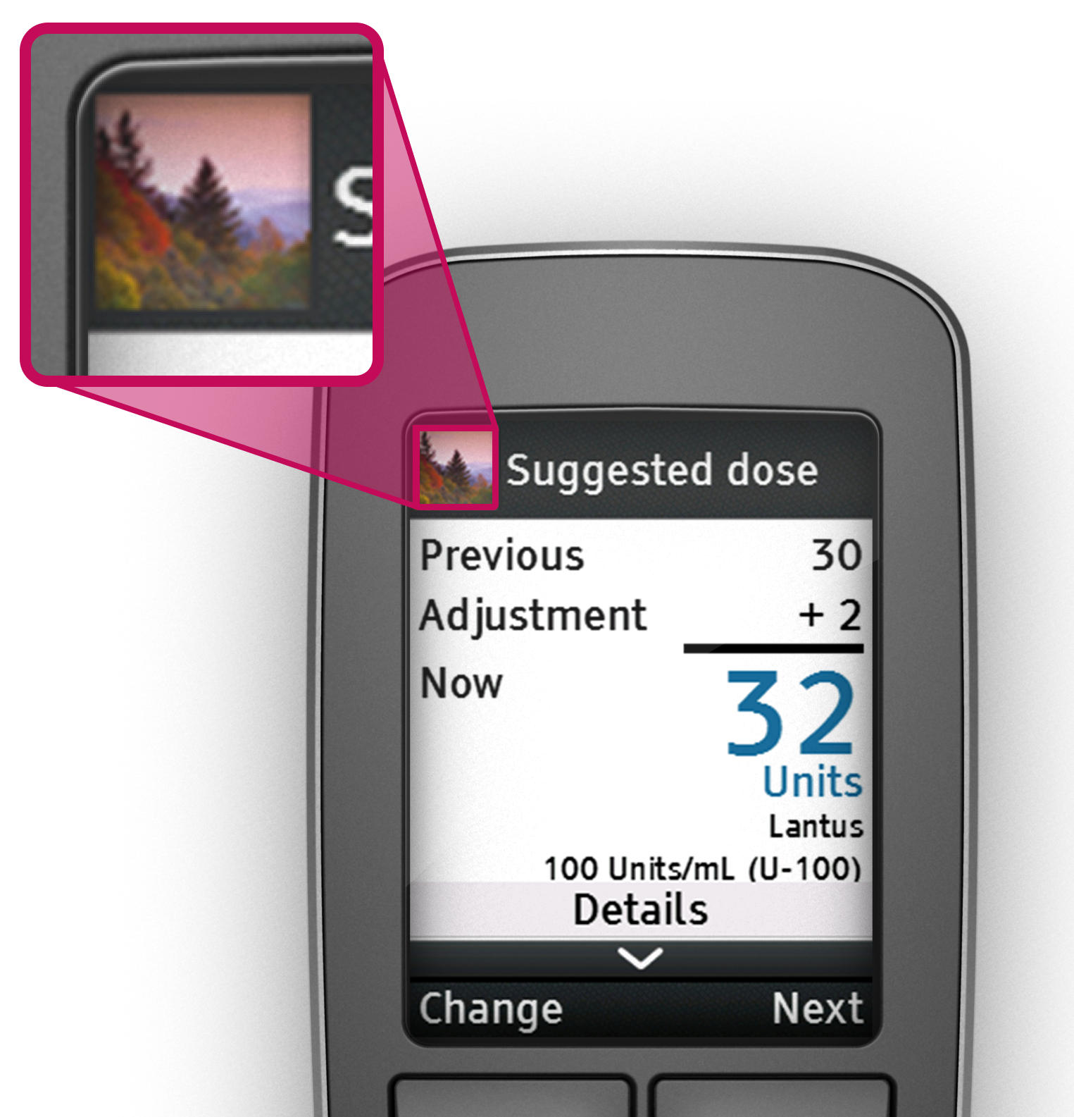
Option 4: Allow users to choose an identifiable image from a pre-loaded set of images.
This option was selected because it met the user need of being able to distinguish between two devices in the same household without burdening the user.
Formative usability
The formative studies for this project ranged from simple surveys to complex tasks using a fully functional demo meter.
Low-fidelity
Early usability studies focused on two areas: the sequence of questions that users need to answer in order to determine the recommended dose and the use of color to indicate glucose level.

Medium-fidelity
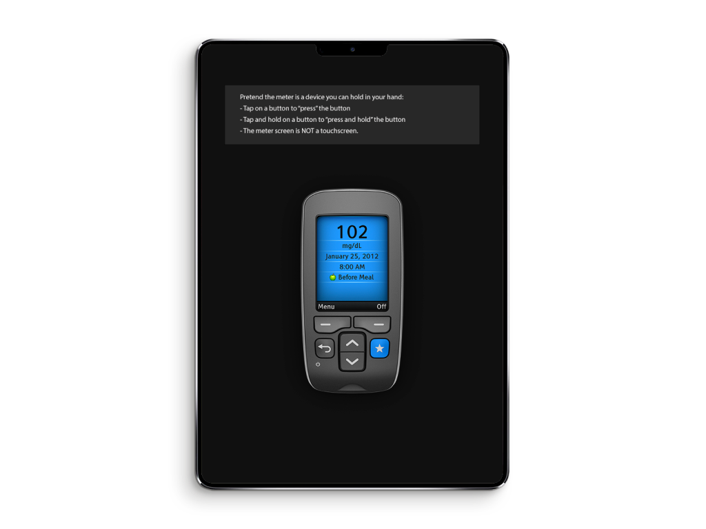
As the design started taking shape, I created an interactive prototype with HTML/CSS/JS to run on an iPad with a picture of the meter at actual size so that users could “press” buttons on the meter. This testing focused on wording and the overall flow through the different tasks.
High-fidelity
Once we had a functional demo meter, we conducted usability tests that ran through full scenarios that the user would encounter.
The final design
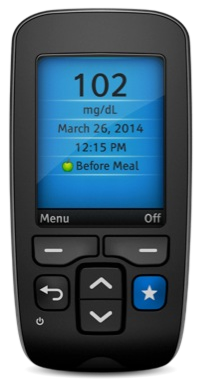
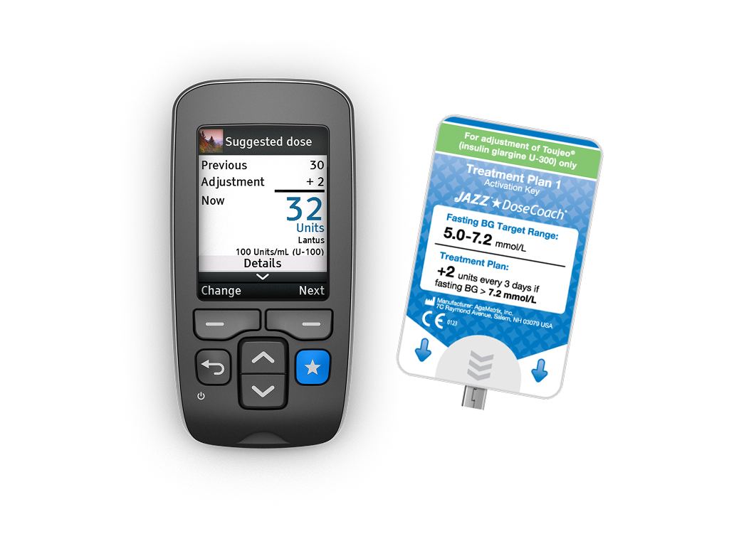
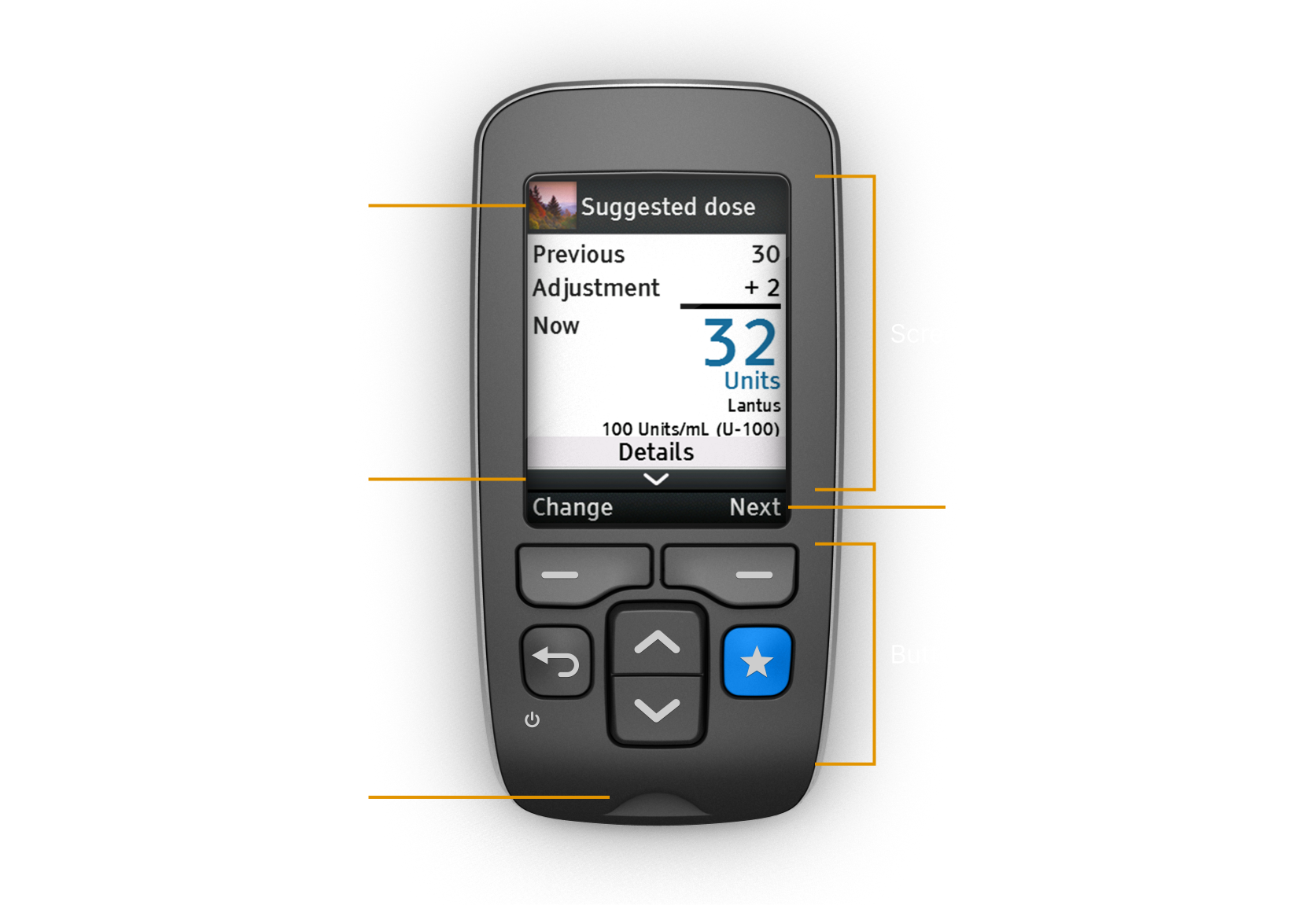
The final design was a hand-held meter with a full-color LCD. The meter has six buttons, two of which serve as soft keys to perform the action of the label above.
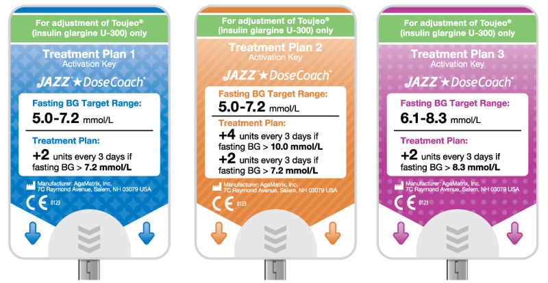
In order to allow the meter to support multiple dose calculation algorithms, we introduced activation keys that plug into the meter to transfer the algorithm to the meter. From a distribution standpoint, this approach meant that different activation keys could be sent to different countries and the meter could be the same. It also meant that as new insulins are developed and research on effective titration advances, new keys can be created without needing a new meter.
Outcome
The meter was released as the MyStar DoseCoach® by Sanofi and later as the JAZZTM DoseCoach® by AgaMatrix. It was the first glucose meter with built-in assistance for long-acting (basal) insulin titration.
A study1 conducted in 2018 found that:
- Patients achieved target fasting blood glucose faster when supported by the meter versus with HCP-led routine titration
- Increased the number of people who reached target fasting blood glucose without confirmed or severe hypoglycemia by 19%
- Participants scored the meter as easy to use with mean a mean score ≥ 6 on a 1-7 scale
Challenges and lessons learned
Designing for hardware is hard
I have designed the UI for a number of hardware devices, but this was by far the most complex due to the features the meter needed to support and the options allowed by the full-color LCD (prior projects used limited colors). Unlike designing for a mobile app, embedded UIs often require starting from scratch. There aren’t well-defined guidelines and best practices like there are for iOS and Android. Even something as basic as selecting and loading a font family can be complicated.
The algorithm is never done
There is always room to improve or tweak an algorithm, so the key is getting it to a point where it is safe and effective within agreed up limits. If you wait for it to be 100% perfect, your product will never be released.
Healthcare models can vary drastically
Because each country handles healthcare in a different way, it is difficult to design a product that can adapt to any model. We learned that in some countries our product would require a prescription and only be available from the doctor, whereas in other countries the product itself would not have a prescription but the algorithm operating it would require a prescription. Our design, packaging, and distribution had to handle all variations.
Adding languages always takes longer than you think
This has been true on every multi-language project I have worked on, but it was even more important because this was an embedded UI. If a translation issue was found after release, updating would not be as simple as pushing a new app update.
1 Davies M, et al. J Diabetes Sci Technol 2019 January 21