Overview
The goal of this project was to introduce a new way for users to interact with the AgaMatrix Diabetes Manager app.
The problem
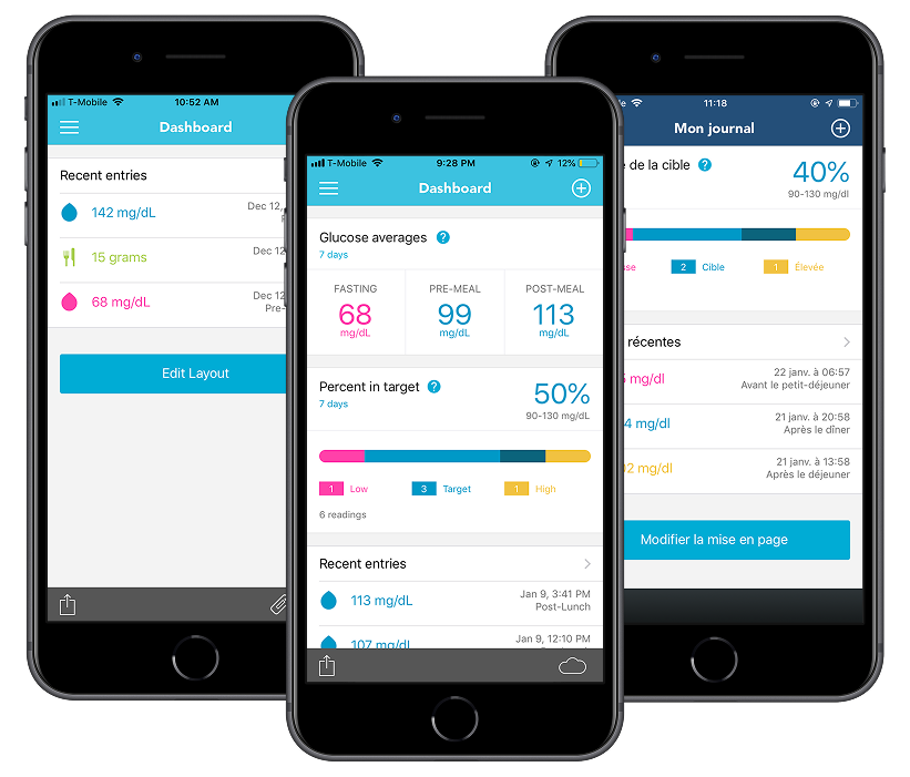
Based on user feedback and app analytics, we knew that the current Home screen, which displayed a graph for glucose, carbs, insulin, and weight, was not working for certain users.
My role
On this project, I led the exploration to determine what features to build and created the design of the final dashboard feature.
Exploration
I started by researching different types of data visualization, both specific to diabetes and for health in general.
Based on a review of other apps and dashboards and feedback from users, I came up with a list of potential statistics to display:
- Estimated average glucose (eAG)
- Estimated HbA1c
- Percent in target
- Glucose variability
- Daily averages
From this list, I decided to focus on percent in target and daily averages (along with averages for other time periods) because they would be meaningful even with a small amount of data. The remaining statistics were saved as potential additions in the future.
In addition to displaying statistics, I wanted to include a way for users to see their recent entries in a table rather than the timeline view. I also knew we needed to allow users to select the type of data to display because, for example, some users want their carbs and insulin entries to be displayed together while others prefer them to be separate.
The final design
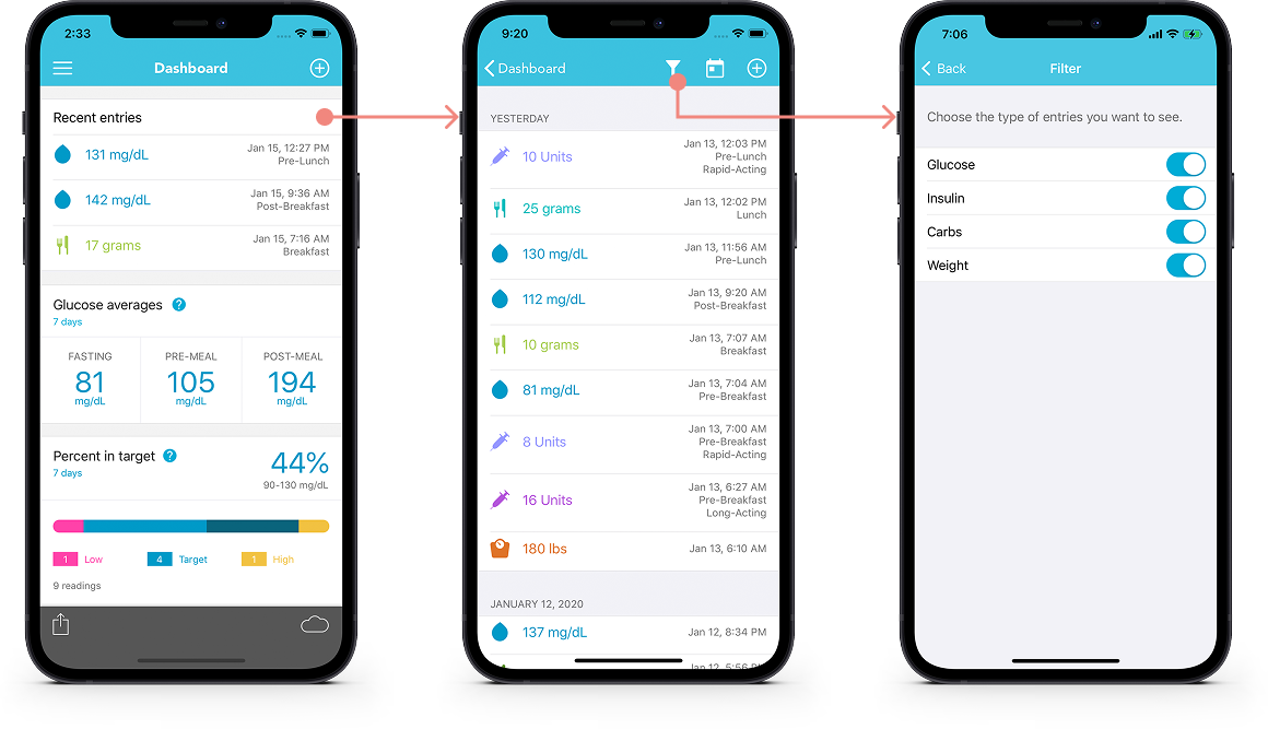
We introduced a new dashboard screen and supporting screens to allow for customization. The dashboard displays a collection of modules that the user can set up and organize in a way that works for them. Users can choose if they want the dashboard or timeline to be the home screen (while still allowing access to both).
Modules
The advantage of the modular design is that it allows a lot of flexibility for users while also allowing for future growth. New modules can be introduced in the future to expand the app’s functionality.
Recent entries
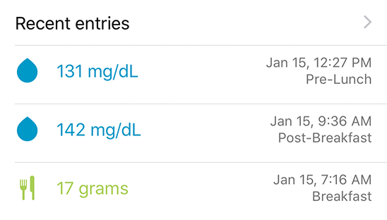
As the name suggests, this module allows users to view their most recent entries. The three most recent are displayed on the dashboard and the user can tap to view the full list. You can filter the module to only display certain data (e.g., only show glucose and insulin).
Glucose averages
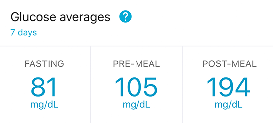
This module displays the average of fasting, pre-meal, and post-meal glucose readings (based on tags or time of day). You can configure the module to display the last 7, 14, or 30 days, or a custom date range.
Percent in target
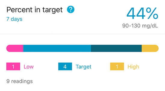
This module displays a visual indication of how glucose readings are distributed from low to high.
